Matplotlib
pip install matplotlibconda install -c conda-forge matplotlib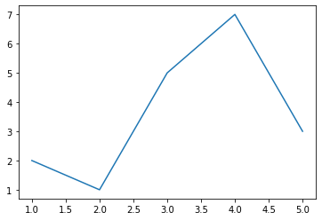
import matplotlib.pyplot as plt
x=[1,2,3,4,5]
y=[2,1,5,7,3]
plt.plot(x,y)
plt.show()
Adding more features to graph
xlable() : Add Lable to X axisylable() : Add Lable to Y axis
title() : Add a title to your graph
grid() : Add grid to graph , plt.grid(True,color='#f1f1f1')
legend(): Show legend on graph
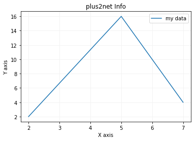
from matplotlib import pyplot as plt
x = [2,5,7]
y = [2,16,4]
plt.plot(x,y,label='my data')
plt.title('plus2net Info')
plt.ylabel('Y axis')
plt.xlabel('X axis')
plt.legend()
plt.grid(True,color='#f1f1f1')
plt.show()One of the important method is plot(), here are different parameters can be used with plot()
plt.plot(x,y,'g',label='my data', linewidth=4)Pie Chart
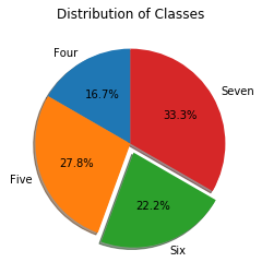
import matplotlib.pyplot as plt

classes = 'Four', 'Five', 'Six', 'Seven'
sizes = [30, 50, 40, 60]
explode = (0, 0, 0.1, 0)
# only "explode" the 3rd slice (i.e. 'Six')

plt.pie(sizes, explode=explode, autopct='%1.1f%%',
        labels=classes,shadow=True, startangle=90)

plt.title("Distribution of Classes")
plt.show()
Bar Chart
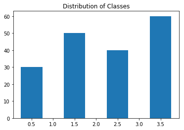
import matplotlib.pyplot as plt

classes = 'Four', 'Five', 'Six', 'Seven'
sizes = [30, 50, 40, 60]

plt.bar([.5,1.5,2.5,3.5], sizes,width=.5)
plt.title("Distribution of Classes")
plt.show()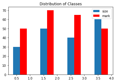
import matplotlib.pyplot as plt

classes = 'Four', 'Five', 'Six', 'Seven'
sizes = [30, 50, 40, 60]
marks=[50,70,65,50]

plt.bar([.5,1.5,2.5,3.5], sizes,width=.25,
        label='size')
plt.bar([.75,1.75,2.75,3.75], marks,
        width=.25,label='mark',color='r')

plt.legend()
plt.title("Distribution of Classes")
plt.show()
Histogram
Shows the frequency of distribution of data. Here we will see how marks are obtained at different rages . Here we can see more marks are obtained by the students in the range 50 to 60.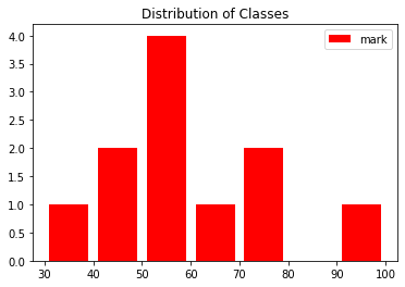
import matplotlib.pyplot as plt
range = [30,40,50,60,70,80,90,100]
marks = [35,55,78,46,48,55,79,95,55,58,65]
plt.hist(marks,range,label='mark',
    color='r', histtype='bar', rwidth=0.8)

plt.legend()
plt.title("Distribution of Classes")
plt.show()Subscribe to our YouTube Channel here
This article is written by plus2net.com team.
https://www.plus2net.com

 Python Video Tutorials